The principles of design can be thought of as a visual grammar. Using these principles, we put together the elements of design to create effective and meaningful communication.
The elements are the “what” of a design and the principles are the “how.” Using the recipe metaphor – the elements are the ingredients and the principles are the directions.
UNITY
The principle of unity is the fundamental principle of design and it is supported by all the other principles. If a design is not unified, it is not a successful design.
Unity can be compared to harmony, integrity or wholeness. In a well-unified design all of the elements work together to create a whole. A unified design is greater than the sum of its parts; the design is perceived first as a whole, before the elements are seen individually.
Unity is based on the gestalt theory of visual perception, which states that the viewer is looking for a unified whole (a gestalt). The eye and brain look for relationships between the elements, for some sort of organization, for unity in the design.
A gestalt is created because the mind simplifies and organizes information. It does this by grouping elements together to create new wholes. Understanding how the mind groups elements (by proximity, similarity, alignment and continuation) helps us understand how unity can be achieved.
 Proximity is based on grouping by closeness; the closer the elements are to each other, the more likely it is they will be perceived as a group. Proximity is one of the easiest ways to achieve unity.
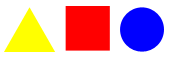
![]() Similarity is based on grouping by repetition; elements that look alike are perceived to be related. Anything can be repeated – line, shape, color, value, texture, direction or size. Repetition helps unify a design by creating similarity between elements and is one of the most effective ways to unify a design.
Similarity is based on grouping by repetition; elements that look alike are perceived to be related. Anything can be repeated – line, shape, color, value, texture, direction or size. Repetition helps unify a design by creating similarity between elements and is one of the most effective ways to unify a design.
![]() Alignment consists of arranging elements so their edges line up evenly. A common alignment allows the eye to group the elements together. A grid is often used to create unity through alignment, not just in a single design but also between related designs (the pages of a magazine or website, for example).
Alignment consists of arranging elements so their edges line up evenly. A common alignment allows the eye to group the elements together. A grid is often used to create unity through alignment, not just in a single design but also between related designs (the pages of a magazine or website, for example).
![]() Continuation means that something (a line, an edge, a curve, a direction) continues from one element to another. The eye will follow a continuing line or edge from one element to other and the mind will group the elements because of this connection. Implied lines are one example of continuation.
Continuation means that something (a line, an edge, a curve, a direction) continues from one element to another. The eye will follow a continuing line or edge from one element to other and the mind will group the elements because of this connection. Implied lines are one example of continuation.
VARIETY
Variety is the difference between the elements. It is the complement to unity and is used to create interest.
Without unity, an image is chaotic and meaningless; without variety it is dull and uninteresting. Good design is achieved through the balance of unity and variety; the elements need to be alike enough so we perceive them as belonging together and different enough to be interesting.
Varying the elements creates variety. Ways to vary elements include:
- Line – thickness, length, value, color, angle, shape (straight or curved)
- Shape – type of shape, size, color, position, orientation
- Color – hue, value, saturation
- Value – darkness, lightness, high-key, low-key, value contrast
- Texture – rough, smooth
An effective way to integrate unity and variety is to create variations on a theme. Just as a composer repeats and varies a musical theme throughout a musical composition, a designer can repeat and vary an element throughout a visual composition.
EMPHASIS
Emphasis creates a focal point in a design which brings attention to the element or area that is the most important. Emphasis is what catches the eye and makes the viewer stop and look at the image.
Emphasis can be created by contrast. An element which contrasts with other elements is more easily seen as anything that is different attracts the eye. Any of the elements can be contrasted: line (a curve in the midst of straight lines), shape (a circle in a field of squares), color (a red element on a background of grays and blacks), value (a light or dark area in the middle of its opposite) and texture (rough and smooth). Contrast can also be created by contrasting orientation in space (horizontal, vertical, diagonal), shape (a geometric shape in an otherwise organic image) and size (large or small in comparison to the other elements). An anomaly, or something that departs from the norm, will also stand out and grab our attention, for example a polar bear on a tropical island.
Emphasis can also be created by placement. A group of lines (real or implied) all directed toward the same place will create a focal point where they meet. Isolating an element from the others by its position in space will also create emphasis.
Since emphasis is created by contrast, if everything is emphasized (all the text is large and bold, all the images are animated, everything is in bright colors) nothing will stand out and grab the viewer’s attention. If everything is emphasized, nothing is.
BALANCE
Balance is based on the visual weight in a design and how it is distributed. Visual balance occurs when the visual weight is equal on the left and right sides of a vertical axis. We are bilateral creatures with an innate sense of balance; when elements are not balanced around a vertical axis, the effect is disturbing and makes us uncomfortable.
Visual weight is influenced by:
- Position – the further out an element is from the center, the heavier it will feel; a large element placed nearer the center will be balanced by a smaller element placed near the edge (think of children on a teeter-totter)
- Size – the larger the element the heavier it is
- Texture – an element with a more complex texture is heavier visually than one with a simple texture or no texture at all
- Isolation – an isolated element is heavier than the same element in a group
- Value – darker elements are heavier
- Value contrast – the higher the value-contrast, the heavier the weight
- Quantity – several small elements can balance one larger element (again, think of children on a teeter-totter)
- Orientation – a diagonal orientation carries more visual weight than a horizontal or vertical one
- Shape – elements with more complex shapes feel heavier than those with simple shapes
- Color – the brighter and more intense its color, the heavier the element will feel
![]() Symmetrical, or formal balance, is also known as bilateral or mirror symmetry. It is created by repeating the reverse of a design on the opposite side of the vertical axis; the two sides are mirror images of each other. Symmetrical balance is considered formal, ordered, stable and quiet. Because of the lack of variety, it can also be less interesting. Symmetrical balance is often used in architecture.
Symmetrical, or formal balance, is also known as bilateral or mirror symmetry. It is created by repeating the reverse of a design on the opposite side of the vertical axis; the two sides are mirror images of each other. Symmetrical balance is considered formal, ordered, stable and quiet. Because of the lack of variety, it can also be less interesting. Symmetrical balance is often used in architecture.
![]() While symmetrical balance is created through repetition, asymmetrical balance is created through contrast. In asymmetrical balance the visual weight on each side of the axis is the same but the elements are different. They vary (in terms of size, placement, value, etc.) and so are not identical mirror images. Asymmetrical balance is informal and more interesting than symmetrical balance. Ikebana (the Japanese art of flower arranging) uses asymmetrical balance to create very dynamic designs.
While symmetrical balance is created through repetition, asymmetrical balance is created through contrast. In asymmetrical balance the visual weight on each side of the axis is the same but the elements are different. They vary (in terms of size, placement, value, etc.) and so are not identical mirror images. Asymmetrical balance is informal and more interesting than symmetrical balance. Ikebana (the Japanese art of flower arranging) uses asymmetrical balance to create very dynamic designs.
 Radial balance occurs when all the elements radiate out from a central point and the visual weight is distributed equally. Radial balance creates a strong focal point in the center of the design. Clock faces and daisies are examples of radial balance.
![]() Crystallographic balance, or an allover pattern, is created by repeating elements of equal weight everywhere. Emphasis is uniform; there is no distinct focal point. Quilts and chessboards are examples of crystallographic balance.
Crystallographic balance, or an allover pattern, is created by repeating elements of equal weight everywhere. Emphasis is uniform; there is no distinct focal point. Quilts and chessboards are examples of crystallographic balance.
SPACE
Space in two-dimensional design is essentially flat; it has height and width, but no depth. There are certain visual cues, however (based on the way we perceive objects in the three-dimensional world), that can create the illusion of space in the mind of the viewer. By using these cues, artists and designers can create images that are interpreted as three-dimensional.
![]() Size is one of the easiest ways to create the illusion of depth in space. A larger image will appear closer than a smaller one because we know that the further away an object is, the smaller it appears.
Size is one of the easiest ways to create the illusion of depth in space. A larger image will appear closer than a smaller one because we know that the further away an object is, the smaller it appears.
 Overlapping is another easy way to suggest depth in an image. When objects overlap each other, the viewer perceives the one that is covering the other to be in front and the one that is covered to be in back.
 Compositional location refers to where an element is positioned vertically in the image. The bottom is seen as the foreground (closest to the viewer) and the top is seen as the background (farthest from the viewer). Elements that are placed lower in a composition appear to be nearer and elements placed higher in the composition appear to be farther away.
![]() Atmospheric perspective uses value, contrast and color to give the illusion of depth in space. Atmospheric perspective is based on the fact that the farther something is away from us, the more the atmospheric haze may obscure our view of it. By lightening the value, lowering the value contrast, softening the edges, decreasing detail and muting the color, you can mimic the effect of atmospheric haze and create the illusion of increasing distance. Shifting the colors toward blue also creates a sense of depth because cool colors recede and warm colors come forward.
Atmospheric perspective uses value, contrast and color to give the illusion of depth in space. Atmospheric perspective is based on the fact that the farther something is away from us, the more the atmospheric haze may obscure our view of it. By lightening the value, lowering the value contrast, softening the edges, decreasing detail and muting the color, you can mimic the effect of atmospheric haze and create the illusion of increasing distance. Shifting the colors toward blue also creates a sense of depth because cool colors recede and warm colors come forward.
 Linear perspective is based on the visual phenomenon that as parallel lines (such as railroad tracks) recede into space, they appear to converge at a distant point. Linear perspective not only evokes a feeling of great depth, but it also creates a strong focal point at the place where the lines converge.
Using these visual cues in combination with each other strengthens the illusion of depth.